CONTEXT
A collaboration project between Saint Elizabeth Health Care x University of Western Ontario (UWO). We were tasked to develop a mobile application that would complement a successful research program at UWO called Hockey Fans In Training.
The objective
Gather and synthesize collected user data, come up with a development strategy and design a minimum viable product (MVP) with a focus on effectively increasing communication within the team outside of classes.
___________________________
problem Statement
To keep program participants socially engaged, motivated, and constantly challenged by creating a mobile application where team members, coaches and staff can communicate outside of weekly in-class training sessions.
___________________________
UX FRAMEWORK
With the help of the research team at UWO we were able to agree on a framework which best suited the timeline, the budget, and the size of our team. We decided to develop the first iteration of the MVP using a LEAN UX framework. This would allow us to manage cost and put out a viable product in less time.
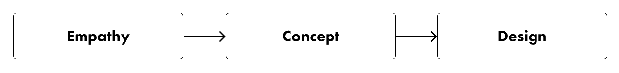
Keeping the chosen framework in mind, I broke down my approach to the project in three separate phases: empathy, concept, and design. The following highlights a few key parts of my work throughout the projects development cycle that I felt help define the final product.
EMPATHY
In this phase I wanted to understand the current participants of the program, what they expected from the app and what pain points do they have when it came to attending in-class training. I also wanted to figure out how I could implement and design features to help act as a compliment to their training.
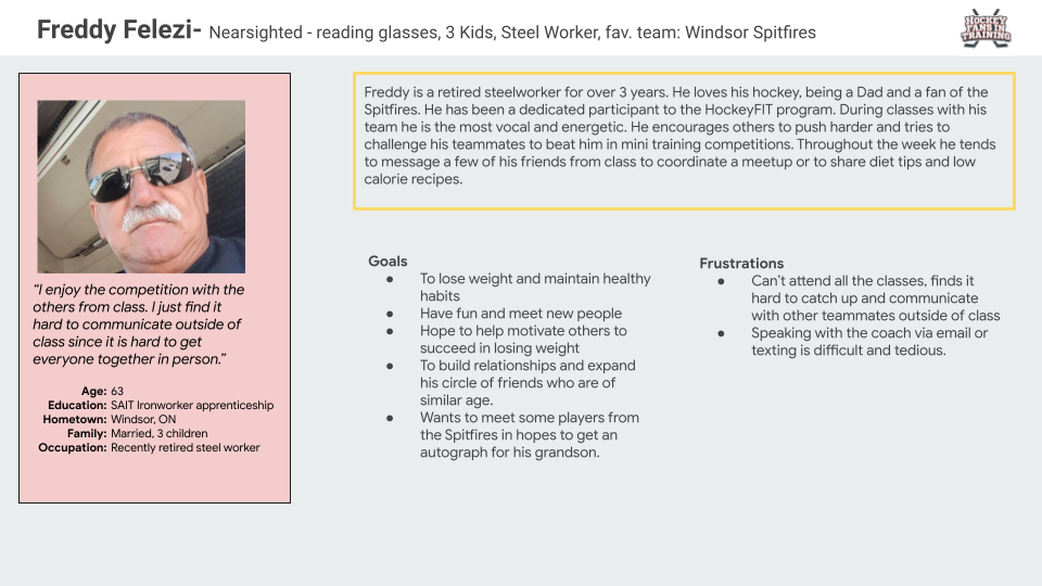
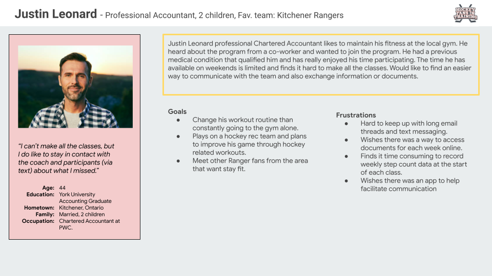
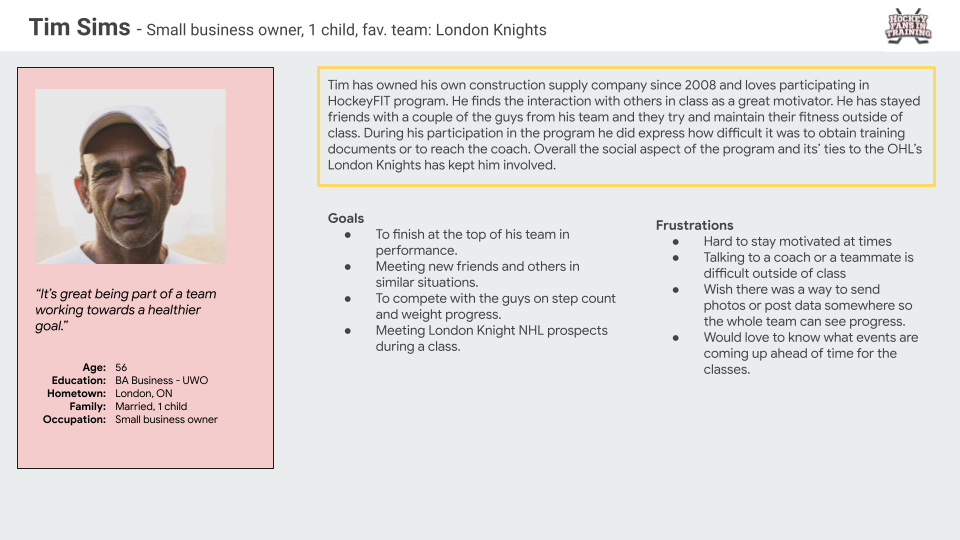
PERSONAS
Gathering information from UWO research staff and coaches, I was able to create three personas that were based on feedback from current and past participants.
CONCEPT
In the concept phase I synthesized the information I collected and utilized a few strategies for visually organizing the data to help me design effectively. This phase also helped stakeholders and developers manage expectations and approve future designs.
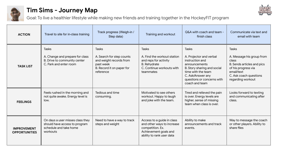
JOURNEY MAPPING
Since most of our feature’s list for the application was predetermined by the UWO team based on their research, I felt creating journey maps helped narrow down what HockeyFIT features were important to the users.
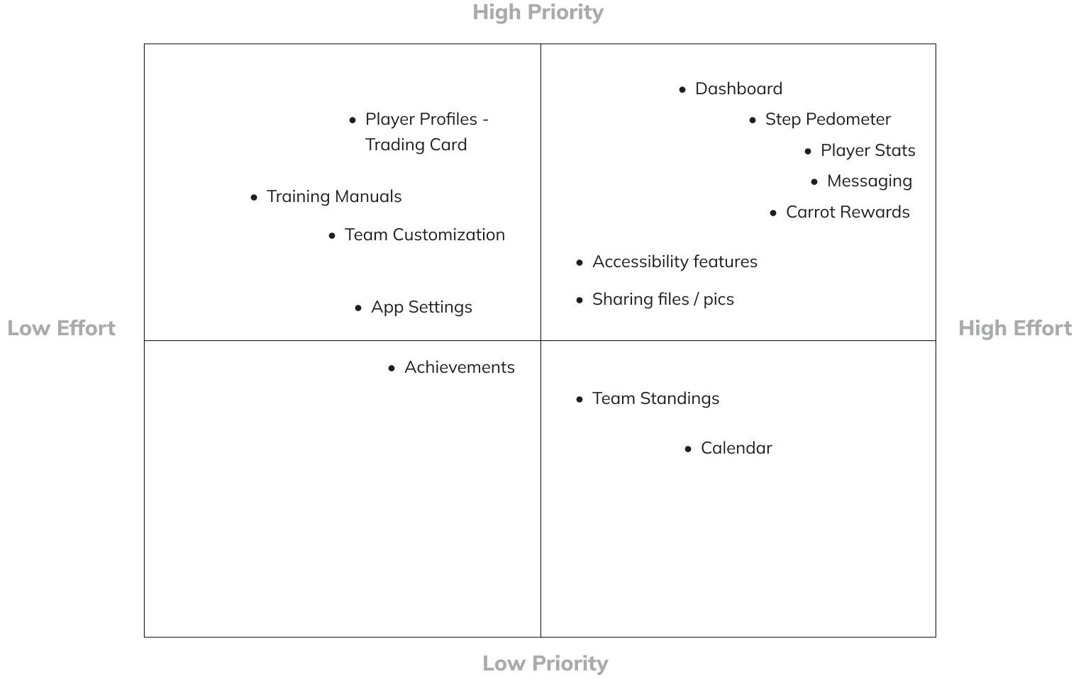
FEATURE LIST - PRIORITY AND EFFORT
I later reviewed feature functionality and requirements with the developers along with the user insights I gained from the empathy process. I was then able to document our findings on Confluence and flush out feature sets on Jira for sprint and milestone planning. After sprint planning was complete, we were all able to vote and give a numerical value to the effort and priority of each feature.
ACCESSIBILITY
With our users being male between the age of 35-65, we had to focus on a couple common disabilities within the specified age group. Throughout my design process I made sure to keep in mind some visual impairment conditions such as colour blindness and poor vision. I addressed this by ensuring we had high contrast in background and foreground colours, larger fonts, and the use of space.
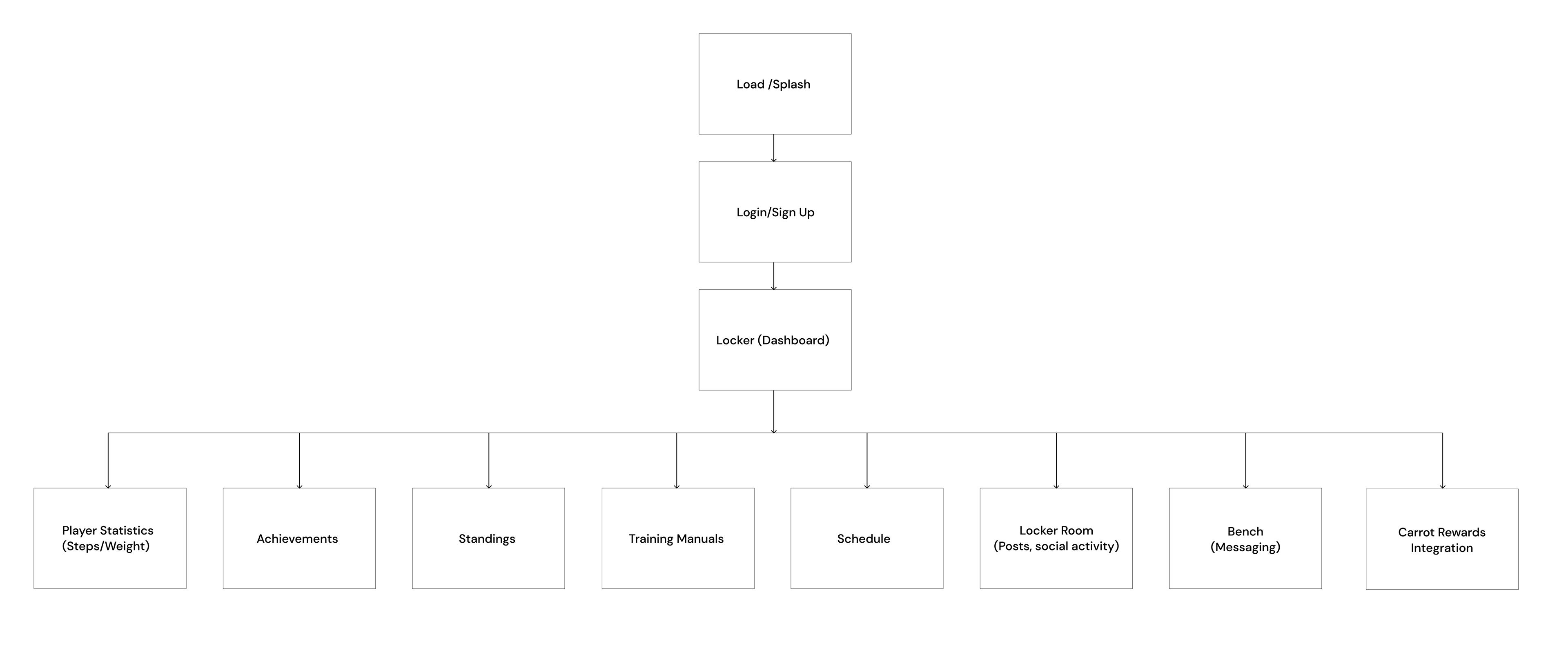
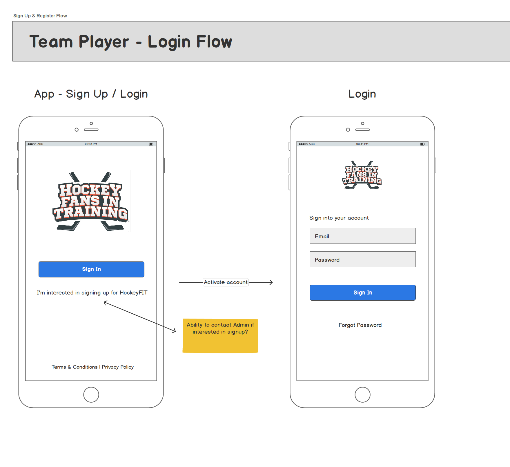
Wire flow NAVIGATIONAL Mapping
___________________________
DESIGN
With the third phase being design, this was where I started the process of creating the visual components of the application. In this phase I chose to highlight one major challenge:
THE CHALLENGE
To build one dashboard page that displays participant information and acts as a compliment to their in-class experience.
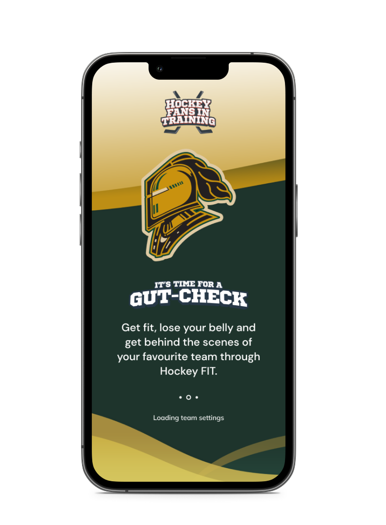
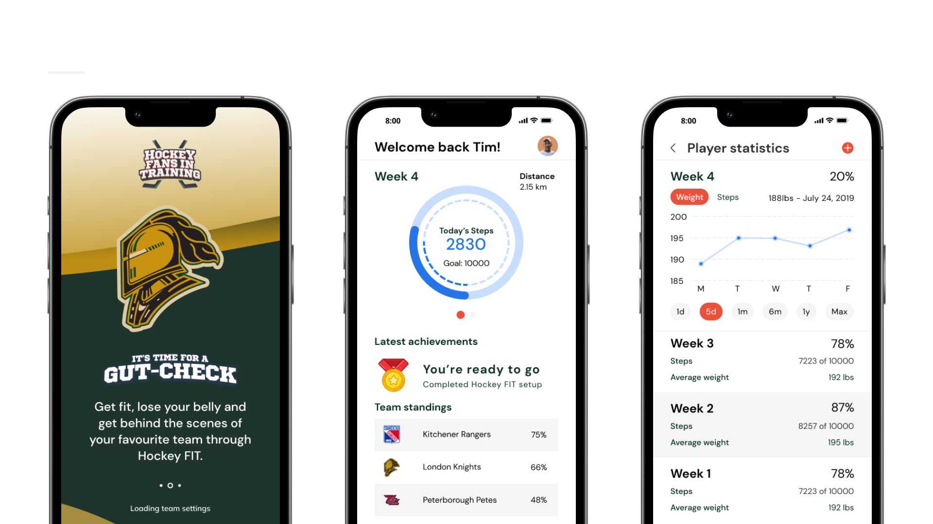
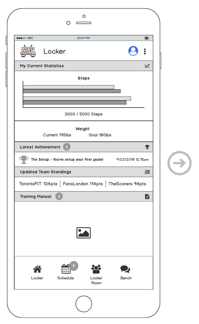
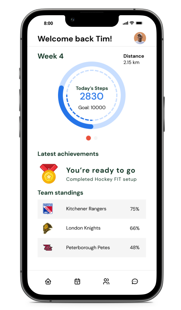
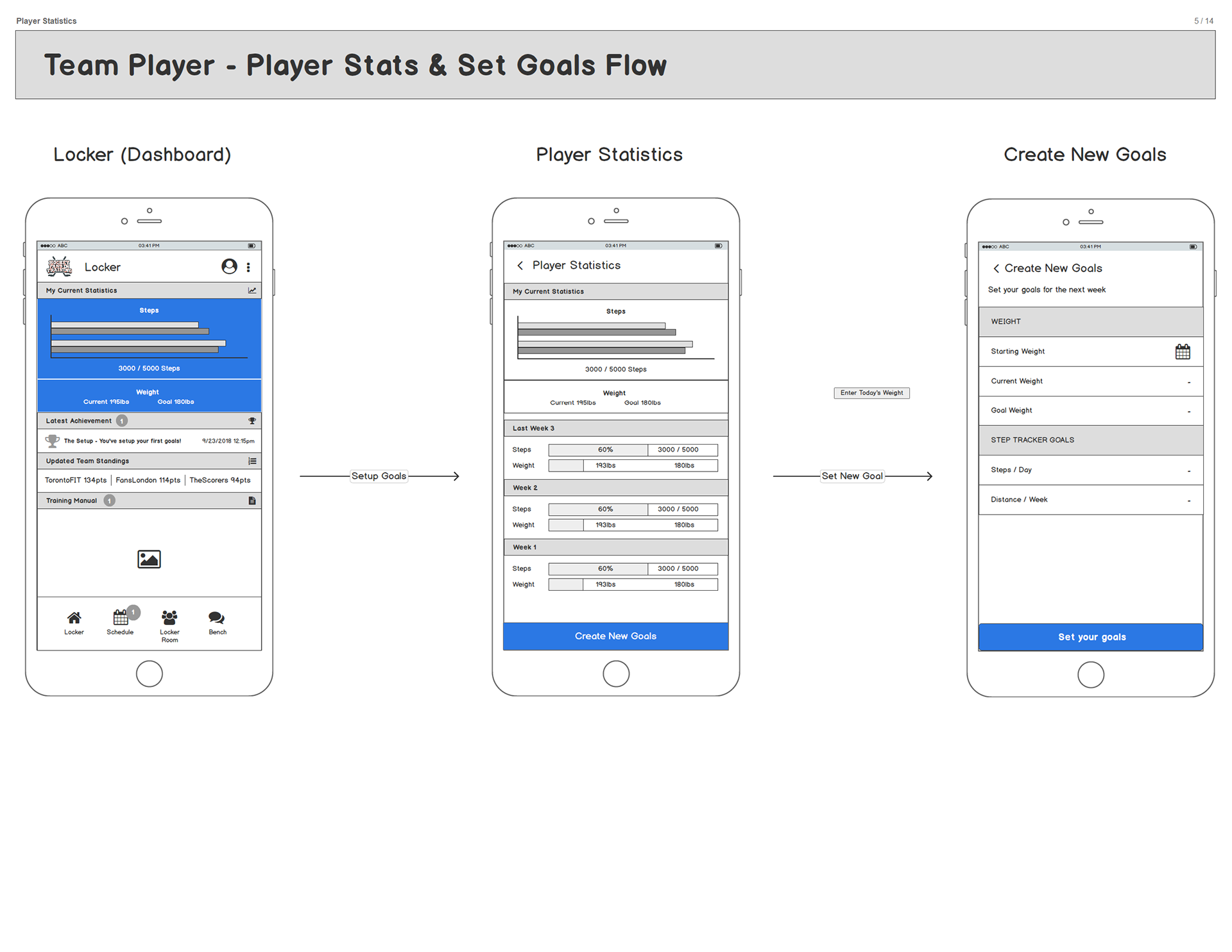
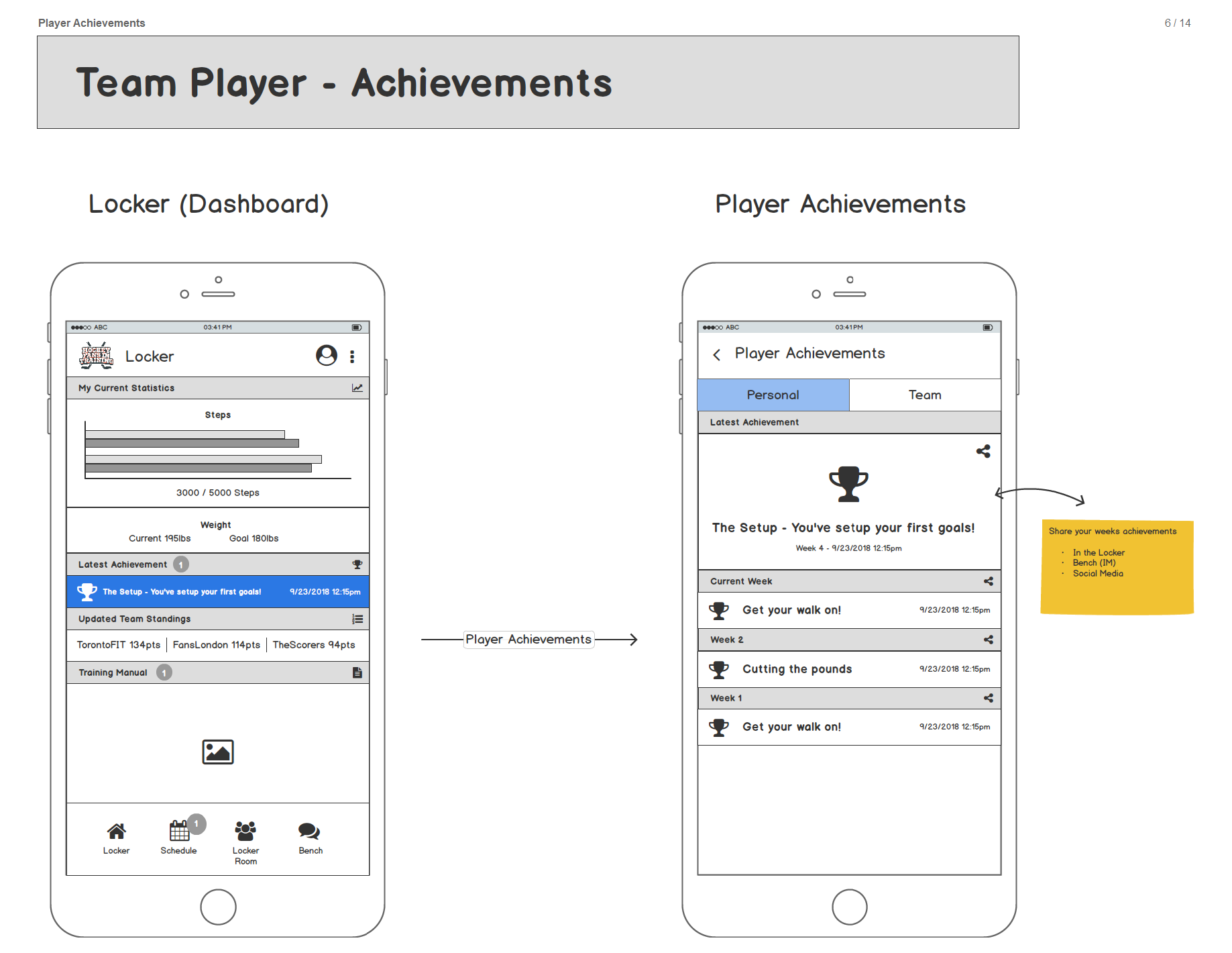
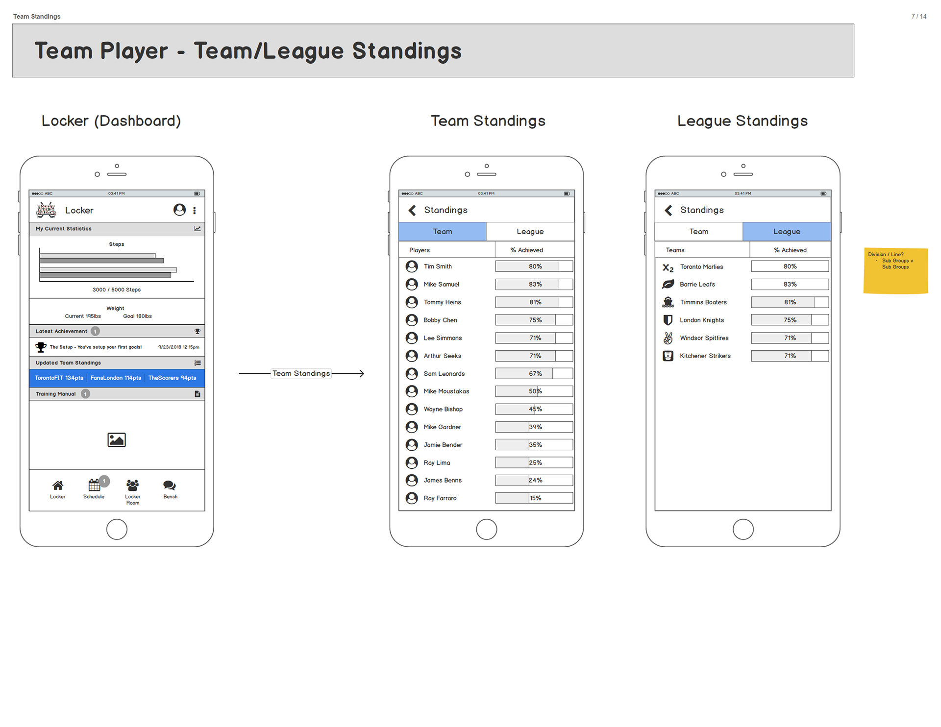
DASHBOARD (LOCKER)
After gathering feedback, it was evident most participants used a pedometer to measure and track their daily steps. There was also an overall sense of enjoyment and camaraderie while attending in-person training classes. Keeping that in mind, I concluded that the most effective approach was to have a dashboard with the most important features of the program displayed and visible as soon as the user signs in. The focus was to display the latest updated step/weight data, achievements, team standings and training manuals clearly visible.
FEEDBACK, ITERATE & PROTOTYPE
Having finished a couple rounds of feedback from users and stakeholders, I was able to iterate with the use of sketches and wireframes to come to a final dashboard design. The design would consist of a navigation bar located at the bottom of the screen with the latest up to date information being displayed. The user will have the ability to view 'past activity' or 'more details' of each category by tapping the sections on the dashboard. After thorough iterations and a collection of constructive criticism, I then proceeded to flush out the wireframes for final approval on flow and interaction/functionality. After this step was completed I had the green light to design high-fidelity mockups which I created in Figma.
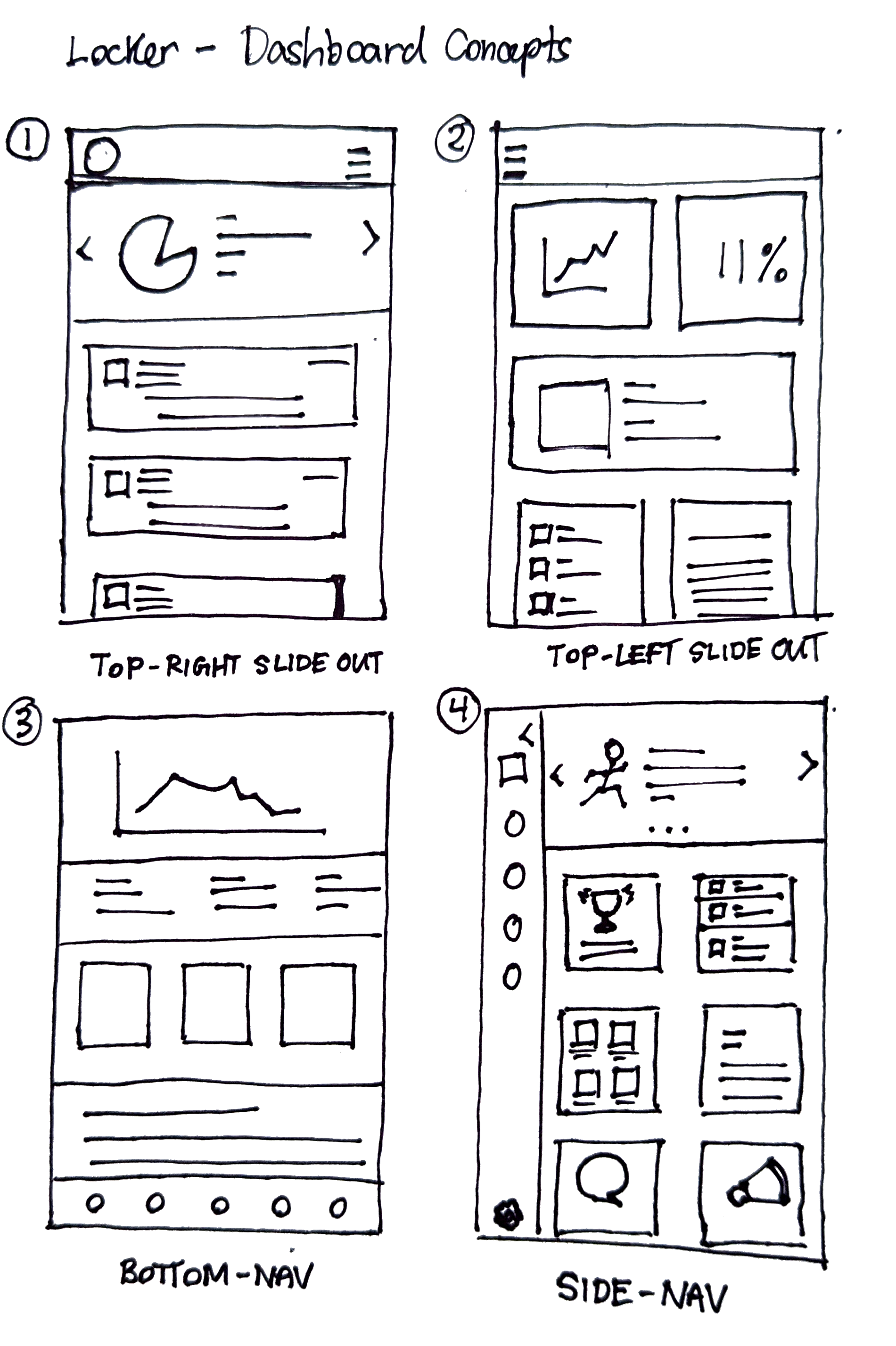
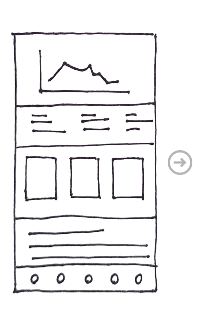
1. Sketching optimal layouts and location of key artifacts
2. Refining of concept sketch with low/high fidelity prototypes
3. Final design after many iterations
WIREFRAMES TO FINAL DESIGNS
WHAT I LEARNED
Keeping open lines of communication between both stakeholders and our development team was a challenging task. Stakeholders were remote and development team was also remote which proved to add another layer of complexity. We also had to integrate a third-party rewards API that was run by another company and that also required co-ordination from a UX standpoint. This project taught me many skills that required me to wear many hats.
For the first time I was also involved in running sprints and sprint planning sessions. I performed grooming sessions and story refinement along with conducting team retrospectives.
Some new strategies I tested out that proved to work for me was to create bi-weekly update meetings that lasted no more than 15mins for all stakeholders. We ran our regular daily development sprints and retrospectives which provided the dev team with critical timelines and updates from stakeholders. At the end of each milestone, I would also schedule a 30min demo presentation of the final build for all stakeholders and leads.
In the end, I found that this communication approach seemed to work best and kept everyone on the same page throughout the project.